Showing posts with label 1. Design and Creative Work. Show all posts

Sunday, February 21, 2010

Dana College Gets RDQLUS

RDQLUS Designs a Custom Tee for the New "Follow the Viking" Campaign.

When Dana College called to discuss having a custom t-shirt designed for their upcoming "Follow the Viking" campaign, I was a little leery of designing a campus t-shirt. I remembered the first week on campus, passing by all the tables & getting glad-handed an awful, gaudy tees that end up being your gym shirt more than your wardrobe staple. So taking this as the challenge, I accepted the project and aimed for a minimal, graphic tee that was more wardrobe status than gym-rat fodder.

A few sketches:


Here's the full mockup:


RDQLUS Designs a Custom Tee for the New "Follow the Viking" Campaign.


Thanks to Nikki Kinsey & Dana College (@DanaCollege) for the opportunity.

Wednesday, February 10, 2010

RDQLUS Goes Clubbin'!

Yeah yeah yeah, I know, I know… Drop shadows, lens flares and glowing effects aren't the high-minded, holy grails of design. All that goodness aside, every now and again it's fun to get your hands dirty with a little rule-breakin', happy-makin', booty-shakin', guilty pleasure fun work that shows Photoshop who's boss. So when a promoter pal called from NYC and needed a fly ass flyer fo' tha' ladeez, I felt compelled to rock it. Nuff said. Enjoy.

Friday, January 22, 2010

RDQLUS Plays Well with Others.

RDQLUS CREATIVE is set up to be able to work not only with my own list of direct clients, but—equally as importantly—I work with many studio & agency entities to do work for their amazing clients. For this Communication Friday, I wanted to show a bit of work that I've been up to over the last quarter of '09 and into this new turn of the calendar. Enjoy, and there's more where that came from.


Good "Friends of RDQLUS", Tribecca Designs (New York City) called me with a need for a unique take for a strong client of theirs that manages taxi cab identifications (called: "medallions"). A fun one to work on this logo tended toward an almost cinematic era of NYC Art Deco and the more romantic times for taxis as the main mode of transportation. Happy clients right down the line.


Omaha Public Schools (Omaha, NE) will soon roll out a new program aimed at giving young minority students a more in-depth look at the impact that their cultures have had on the Omaha area and regionally throughout the Midwest. The "Making Invisible Histories Visible" program will use more culturally traditional means of gathering spoken histories, recipes, conversations with community elders and hands-on exploration that delves deeper than shallow archival information. With this information in hand, RDQLUS was set about the task of shaping a youthful—yet serious—new face for the endeavor.


When my personal a dear friend called in need of a favor for her 7yr old niece's dance troop, "Fusion", it took all of 2 seconds to agree to help. I know and agree with the rule of doing business with family, but the truth is there are sometimes when the call is bigger than the rule. This one was a favor for a friend that has literally put a roof over my head and food in my belly without question or fail when I was in need. So sometimes in life you have to pay it forward, willingly and gladly. It's not that I think it's award-winning, but that it was just a labor of love and an exercise in working very light, and very fast. And if you knew all the love and support this friend has shown me… it's already heavily paid for and I still owe. ;-)


More to come stay, tuned…
---
Stevie G.

Sunday, December 20, 2009

Abigail & Adam's RDQLUS Wedding Invite

There is widely-known rule in the design world: avoid working with family! As most creatives know, we rarely follow that rule. On top of that, brides are to be feared. Well, I ignored the potential pitfalls to do work for a young lady that is like family and getting hitched. I'm happy to say right away, she was a delight to work with. She had a vision for what she wanted and "married" that (pun intended) to the process and her trust in her designer. Nice! The couple wanted to be very price conscious where they could and still have a quality product with a hand-finished look, the finishing of which the bride-to-be wanted to handle, herself. Add to that, that this is for what will be her and Adam's most special day to date. With that kind of client the weight shifted from shouldering the load of a potentially impossible client to wanting to do all that I could to play Atlas to this globe-sized expectation.


For the design, I drew inspiration from the flowers that she has picked for her wedding day—peonies. A particularly difficult flower to silhouette or interpret, I actually paused on that approach and moved to looking at typefaces. And there it was: 'Affair'. (Ironic name for a wedding invite, but we'll read it in a good way) The sweeps and gentle, yet decisive bends of this font was too much to ignore. As I tested out a few phrases to get a look at letters and ligatures, it hit me; Could I possibly create a peony floral from re-purposing these letter-forms? A bit more serendipity as the forms I'd need to use came into focus: (2) families become (3) families as these (2) people come from each family to form a new one. There's also the fact that they will bound together in the eyes of the & the Holy Trinity. So with the numbers '2' & '3' of the typeface I created the "numeric peony" logo that would be used on both the invite and r.s.v.p. card.


The printing was done digitally to keep the costs within budget, and the paper selection would be critical to the finished product. Both was masterfully done by industry pro, Tanya Patry, rep'ing for Leading Edge Printing here in Omaha, NE. The invites and r.s.v.p.(s) were printed on Cougar Natural Cover and the holder/wrapper was cut from Classic Columns Epic Black Cover.

When Abi came to pick up the parts, she simply said "LOVE them! I'm happy, and the color is better than I expected." A designer could make career of chasing such words. Congrats to Abi & Adam and best wishes for a long, loving future.

(Thanks to Tanya Patry and Leading Edge Printing)


--Stevie G.

Friday, December 18, 2009

RDQLUS Designs Cover For Pulitzer Prize Nominee


It's an amazing thing, the 6º of separation that truly does exist and just how short that space between can seem. Months ago at an Omaha Tweet-Up event, I met a young lady who was looking to help a struggling non-profit organization find a bit of professional design help. I just so happened that this organization was a community center that I had attended as a young man growing up in the inner-city, the 'Wesley House'. Say that name to anyone from North Omaha between the current ages of 25-40 and a proud smile will slide across their face. This place was a hub of my particular neighborhood but mostly in a summer camp setting for those who surely couldn't afford the glorious "Meatballs" experience. That alone would have been a saving grace full of knowledge and arts-and-crafts experiences, but there was a need—more so a call—to be more. Enter the times we live in and the struggles that financial short-comings bring.

That's where Mr. Paul Bryant comes in. To see him now is to see a razor sharp, sure-minded, firm-voiced gent often donning head-wear that would make the "Bear" himself proud to share a name. Paul Bryant is from the same streets where I grew up and found himself in the same predicaments that many of our counterparts faced and didn't escape from. After our introduction, there was first a very long conversation about the old "hood" and where the Wesley House had come since the times I attended. I needed to be brought up to speed because Mr. Bryant had a vision… the arts-and-craft approach had been good but was more akin to babysitting than true teaching. He wanted to see the place become a haven of building, molding and cultivating young minds to not be tolerated, merely lucky, nor babysat, but rather to be those who are found reaching and attaining goals through disciplined approaches to the game. So to that vision has now manifested itself as the 'Wesley House Leadership Academy'.

To the point, Paul Bryant has a message that feeds the vision; Living life, no merely with a goal but with an over-arching purpose that drives us constantly. To aid him in speaking engagements and meetings, he self-published a book 'The Purpose-Living Leader', yet the project had stalled a bit. That's where RDQLUS came in. As he explained his aim with the project, we began to talk things through and as a bit of paying it forward (or backward as the case was), I offered to help by creating an identity for him and his work and cover for the book project.

A few months later I got a call to have a it of lunch and catch up with Paul, where he informed me that the book had been nominated for a Pulitzer Prize and the message looked to be taking hold. It's nice to do a bit of "pro bono" work that's more like a return on an investment that someone else made in me long ago.


--Stevie G

Thursday, October 22, 2009

How RDQLUS'ly Sketchy 10/22/09

"SIR… BACK AWAY FROM THE MOUSE!"


Rolling on some black-marker comps for a project with an amazing creative outfit out of LA, Cali.
No, don't ask, because I cant say who or what for… not yet at least! ;-)
Check back, I'll fill you all in later.


Think RDQLUS can help with making your project a little sketchy? Holler this way…
("HEEEEEEEYYYYYYYY RDQLUS!")
sorry, couldn't resist the cheeseball joke. ;-)

"iD-Rx" for NYC-based fashion designer Trudy Williams

It's always fun to get to be creative in ways that are often a bit outside of the stereotypical trappings of pixel-wrangling that we design heads normally find ourselves operating within. Thinking, writing, researching, and thinking (yes, some more!) is something I always look forward to, especially when it's in the process of using my process named "identity therapy" or "iD-Rx" for short.

I recently completed my "identity therapy" brand assessment process for New York City-based fashion designer, Trudy Williams and her upcoming line that will bear her moniker. Ms. Williams is an amazingly creative person with an very particular personal aesthetic that bleeds across into her work. She has a very cool revisionist view on creativity and construction that is not all about doing the next big thing but rather revisiting the refinement and details to give her line that intangible "something" that makes it special to her customer, who are a very particular lot. Let me tell you, her story goes deep and it was a pleasure to flesh out and help her establish some key points for the brand to move forward.


("iD-Rx" - 'Trudy Williams')


(foundation & pedigree)


(brand stance, voice & mood)


(color theory as tied directly to the mood & pedigree)


(birds eye view of visual mood, color palette & an example of possible combinations within the brand)

Monday, August 17, 2009

New Stationery Design for INDIE IMAGES

Photographer and "Friend of RDQLUS" Nancy Dobler approached me to do a cost-effective and simple stationery design for her new start-up photography outfit. With an Art Deco-style identity and a measured and graceful personal style, I wanted to give Ms. Dobler something just as stout and clean with very high-contrast. The card is 12pt thickness, with a full UV gloss on the information side. To add a mysterious touch of style and subtle bravado, much like Ms. Dobler herself, I designed the back of the card to have a clear spot UV on matte black for both a textural and visual contrast, taking the fact that there is no color–other than black and white–to a next level, adding a fully visible element using no color at all.


All was done with cost and utility in mind as print budget was a major concern. In the end, there was a happy client and a final production that I was proud to hand over.

When It's a Tat, It's an Honor!

I recently got a sweet "tweet" (a Twitter message, for the non-online socialites) from a happy former client wanting to show off something really rather flattering for any creative who does this for a living.

It appears that the identity I fashioned for them has moved into the highest level of wearables–the temporary tatoo!


"Check this out Steve: http://www.flickr.com/photos/loraincounty/ We have people calling to wear logo now!"
(via @BRaBMultisport on Twitter)


Now how cool and RDQLUS is that?!


(pictures courtesy of Visit Lorain County on Flickr.com)

Friday, July 24, 2009

Take a Spot on the RDQLUS Couch for some "Identity Therapy"

For a long time I've had a particular way of getting the info I need from my clients to do the best work possible for them, but it lacked a few key points. So over the years I've asked and borrowed and tweaked my process until it finally was far more useful than it had ever been. But… it wasn't fully ready yet. Then my good friend, and a client of mine, Jeni Herberger said something that caught my ear, "This was like therapy! You told me some things I didn't like and may not have wanted to hear but I came around. Yeah, it's therapy!"

And so came the name of the process: "Identity Therapy" it shall be!

My "Identity Therapy" process is simply my old trusty creative brief that I turned into a process and an actual product that the client takes active part in, and then ultimately owns and stands behind. Because of client buy-in and ownership, many traditional designer/client potholes are held to a more scientific method and less to the whims of either party, vastly reducing the traditional friction that comes with it all.

The tangible result of the "Identity Therapy" is an actual document of info that becomes the initial "brand story" and culture which many small start-up businesses never get because they come rushing in asking "can you design me a logo?". Yeah but I'd rather give you a full identity and brand. So in essence, it's a slimmed down, candid, straight forward way to get the info I need to do my work, all while giving the client a seat at the table, holding them accountable in a gentle but honest way and then rewarding them with the brand story that you built together.

Truth is, I developed this process working in corporate life to stop the ages old tug-of-war over ownership of the creative process between the internal clients (other silos & departments) and the marketing/creative department. I kept refining it over years and years and started to call it "Identity Therapy" because clients really got into it and had a story to tell, so I'd just sit and listen.

It's not painful, although a few tears may be shed. ;-) Wanna have a seat on the RDQLUS couch? There's much I'd like to know about you.

Monday, May 11, 2009

What a Release! The book has dropped

May marked the release of my first book and I am way too humbled and excited for words! '100 Habits of Successful Freelance Designers', published by renowned creative industry publisher–Rockport, focuses on some very candid basics of going solo in the field of creative arts. Creative independent experts lend their insights and habits, from financial suggestions to how to get over the doldrums of creative block, as well as their fine artwork as indie designers.

I was tasked with writing all of the chapter intros, curating the artwork and habits of the experts, adding my own "habits" to the mix, as well as the honor of doing the cover design. I also developed a full set of line-drawings that accompany the titles and habits throughout the book.

This was an almost two-year process that tested and bested me at times, but ultimately taught me a lot about myself, my love of writing and the publishing industry on the whole. I truly cant wait to do it again, but not until this one settles in (which it may never!). as

100 Habits of Successful Freelance Designers can be found at this link, as well as through local booksellers, nationwide.

Friday, May 01, 2009

RDQLUS CREATIVE: Dyana Valentine iD & branding

Last year, I met a gracious, in-your-face, dynamic personality in the form of mentor/speaker/teacher, Dyana Valentine. Frank, honest, candid… and yes that mane of untamed goodness… she was in full command of the room as she spoke to eagerly listening freelancers, at the HOW Creative Freelancer Conference in Chicago, about finding our just who they were and what their focus was. Little did I know that our paths would cross and I would get the opportunity to do the same for her as a client.

Using my iD creative briefing process dubbed "Identity Therpy", I was able to take an assessment of who Dyana was at her core, her beliefs, and her message, which is that of passion for finishing what you start mixed with her own vibe quoted as "elegant utility". Wow was THAT tons to go on! And still again, there was that mane of untamed goodness…

So I steered directly into the obvious. Dyana Valentine is a sparkplug of a personality, but most people don't have an iconic and almost trademarked trait. She does, undeniably. She knows it, and she owns it, and anyone who comes within 100 feet of her can't forget it. But there had to be more to it, more substance—a back-story. So to create the silhouette of that iconic hair, the choice was made to create said silhouette from other icons that would represent aspects of her life and message that she brought to bare for hear audiences and clients. Each icon has specific meaning: big ideas, teaching, benevolence, searching for the details, hard working, yet regal and natural, raw energy. All of this that actually makes up Dyana Valentine comes together to make up the mark that represents her as a professional entity.


The full mark itself can be broken out into three phases: the "icon fro", the nameplate, and the icons themselves as useful tools for categorization and presentation of messaging and topics.


The new iD gave way to branding items that were necessary in the roll-out of her new professional suite.


Dyana is also known for her "Hello, I'm Really Good At…" stickers that are both teaching tools and ice breakers. So with a new iD, why not brand those also? A solid brand from top to bottom is a fine avenue for clear, consistent visibility messaging.


I'd like to say a big thank you to Friend of RDQLUS, Jeni Herberger, for the formal introduction to Ms. Valentine. I'd also like to thank Dyana Valentine herself for hbeing such a joy to work with and an exciting client. For more about Dyana Valentine and the amazing work she's always up to, visit www.dyanavalentine.com

Tuesday, April 28, 2009

"HOW AUS10TAYSHUS" Can RDQLUS Be?!

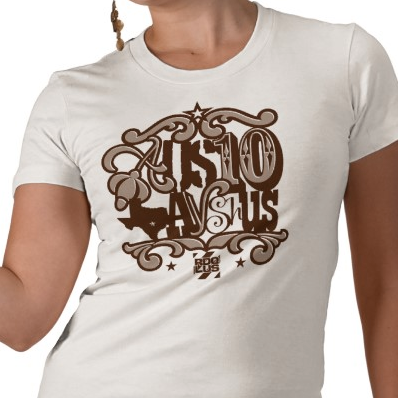
HOWaustin 09 Custom Tee from RDQLUS CREATIVE

So yesterday, by way of Twitter (@rdqlus_creative), I hinted at a limited edition, custom design for the HOW Design Conference '09 to be held in Austin, TX this summer. Well a sneak-peek of the new design has surfaced!

The overall design is a fun take on the name 'Austin' and features a random-typeset spelling of the word 'ostentatious', meaning: "designed to impress or attract notice". Well, uh… YEAH! The "HOW AUS10TAYSHUS!" design will come in (3) varieties, each featuring one of the RDQLUS identity colors.


The scrolls, stars, and cobbled-together typefaces all have a fun Southwestern feel that is decidedly Texas, while staying contemporary and avoiding and old, campy or played out look. The idea is to give mad props to Austin for all of it's creative vibe and cultivation of contemporary arts and creative cultures!

For more info on the HOW Design Conference, click thru here. Stay tuned to find out when and where this RDQLUS limited edition design will surface! Also check out 'Friends of RDQLUS' 36Point to see their plans for HOWaustin!

Monday, April 13, 2009

RDQLUS CREATIVE; Identity Work - The Purpose Driven Leader

Through a very interesting '6 degrees of separation' I was introduced to Mr. Paul Bryant, an Omaha-area businessman who over the last 4 years has assumed the reigns at The Wesley House Leadership Academy in North Omaha. A staple of that community, I myself attended The Wesley House as a youngster growing up around the areas between Lake and Hamilton streets.

With the many projects that Mr. Bryant is working on, he wanted to begin to brand some of his speaking and teaching materials for greater impact and reach. So in a bit of paying-it-forward (or backward in this case) I fashioned a mark and title block for him to have the beginnings of an identity for his endeavors.

The Purpose Driven Leader series of works will be about the schooling, emotional and moral instruction. Starting with young men in the North Omaha community due to the location of The Wesley House, the message will extend from young men and women to even established adults of all races and ages.


The mark itself shows an instructor organizing a group of young men with his focus on the very young and as they get obviously older, they are further back in the line-up, more and more ready to go out on their own with the lessons learned. The silhouettes are created as much by what is not there as is what is there, allowing the eye and the mind to finish the composition by filling in the gaps. The very strong figure/ground relationship makes it an easily reproducible mark on a variety of mediums.

It began with young men because sadly the statistics are such that it is the young men of the community often pulled into less than favorable situations. By helping the young men of a community, it is often a large help to the community on the whole.

My thanks to Paul Bryant and The Wesley House for the kind reception and the chance to work with them on what is sure to be a growing initiative.

Saturday, April 11, 2009

RDQLUS CREATIVE: Corrie & Andrey Photographers, Pricing Sheet Design

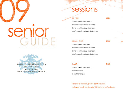
I was contacted by the very talented duo of photographers, Corrie and Andrey Photographers, to have a sit down and discuss how RDQLUS CREATIVE might be able to help sharpen their identity and help their brand gain a little focus in the market. To ease into the process and have a jumping off point, we chose to go with a revision of their Sr. Photo pricing sheet showing their products and offerings mainly aimed at high school girls looking to get high-end, "model for a day" fashion shoot style sr. photos.

Initially the pricing sheet was (3) separate loose pieces that bore a slight resemblance to each other and truly didn't establish their identity or brand. These pieces were also available for download and desktop printing at the customer's leisure. this posed a problem in the degradation of what little branding was established because of limitations outside of their control such as print quality, margins/lack of bleed and color vs. black and white. Also, (3) sheets of loose paper with no binding just wasn't a cohesive pricing package. The overall look and feel was not particularly alluring to their desired customer base, so that would be an additional challenge to get the aesthetic to be a bit more attractive to their desired clientele.

before getting RDQLUS:


_____


The RDQLUS solution was to take the information down to a 1-fold, 4-panel brochure with the ability to be printed either duplexed, front & back or as a two-sheet print out. There are no bleeds or margin interruptions, so on the customer side there is no worry about the output.

By establishing a color palette much closer to their identity (which was already in play) we were able to get the overall vibe geared more toward young ladies. Couple that with the use of floral elements and their own scroll artwork we now had a look that was locked in on current trends in teen fashion and style.

after being treated RDQLUS'ly:


I was also able to contribute copywriting assistance with titles, subtitles and verbiage throughout the piece, which aided in the overall "model for a day" messaging that the client wanted to portray.

___


I'd like to thank Corrie and Andrey Photographers Corrie and Andrey Photographers for their cooperation and willingness to dive in and give some new thought to focusing the look of their product offerings by solidifying their identity and branding. RDQLUS CREATIVE looks forward to working with them again in the future.

Friday, March 20, 2009

RDQLUS New Identity Work: CONCEPTORQUE

A brilliant young thinker and "Friend of RDQLUS" approached me to fashion an identity in line with his upcoming endeavor. Jon Husted is one of the most open-minded and talented young thinkers I've ever met. Superbly talented as a writer, photographer, and burgeoning creative director, Jon is a "techie" with a mind for all things new and pension for all things classic.

With 'CONCEPTORQUE' he will put this wealth of talent and skill to work, so I wanted to give him a look that was a bit 50's sci-fi but not so much that it was dated and not relevant now and in years to come as his project grows. The mark represents a new take on old motifs of putting in work and reaching that "aha!" moment went an idea comes to the point of action.

It's a little hush right now, but keep an eye out for this one. He's destined to blowup.


Tuesday, March 10, 2009

'Masterworks'?! Yep, That Sounds RDQLUS!

A few months back, I was thrilled to hear that RDQLUS would have work featured in the upcoming annual LogoLounge 5. For any identity designer, getting a spot in such a well known compilation is a good feeling. Like it or hate it, at least they recognized it. So as I'm checking my email I just about trashed a notice from LogoLounge… I mistakenly thought it to be an old email popping up. Luckily I gave it one more read...

RDQLUS is to have two logos featured in the new "Masterworks" series developed by LogoLounge. The first iteration of the series is to be deemed "Initials & Crests". The first logo to be featured is a joint effort designed with talented designer and all-around awesome-dude, Travis Bellinghausen, currently creative lead at Corporate3 Design in Omaha, NE. The design, the "VNDK8 Grandroyal Crest", was one of the featured marks for our apparel & style brand 'VNDK8 Freestyle' (which is making a return this summer… stay tuned). Travis & I had a lot of fun bouncing this crest back and forth on what started as just a t-shirt design.


The next RDQLUS logo to get the call up to the 'Masterworks' is the mark for "Back Roads & Beaches", an outdoor recreation initiative organized by the Lorain County Visitors Bureau of Lorain Co., Ohio. Lorain Co. plays host to amazing outdoor rec activities and their big draw is the fact that in the square mileage of this one county, bordering the south shore of Lake Erie, there is beaches, road bike and cross-country mountain bike trails and plentiful opportunity for nature walks/hiking/climbing.


Thanks to LogoLounge for the inclusion, and really, thanks to all of my clients past, present and future who think getting a little RDQLUS ain't such a bad thing.


Steve G.
RDQLUS

Thursday, February 19, 2009

Cer-Té'nly a Nice Project.

Well it has been a little bit since my last post, but trust I've missed you. So I'm back at you with some goodness!

Once again, I had the good fortune of collaborating with my dear friend, the most awesome Rebecca Leigh Brian, and her bi-coastal studio Tribecca Designs. This go round, Tribecca's long-standing client was a fantastic caterer and boutique cafe by the name of Cer Té. Having made a name in catering their current storefront location was an energetic mix of catering, walk-in sack-lunch'ers and sit-down diners. The back dining area seems miles away from the bustling street not but a few steps away. So as you sit and sip an espresso and look over your menu, you're happily greeted by warm, friendly staff and you really are transported to another place right in the middle of the Big City. Can you tell I've been there and I LOVE it?!

I was commissioned to work on a series of drawings that would then be made into poster art that would hang in the dining area of their storefront location on West 55th in Manhattan, NYC. Naturally, I jumped at the chance, creating loosely styled "art nuveau" drawings that would soon become the posters that would hang in the dining area. The idea was to visually transport the customers to other nondescript places around Europe lending to the ambiance of the dine in experience at Cer Té. The result was a series of (4)-18" x 24" posters and (1)-40" x 32" poster matching the style, color and vibe of the cafe itself.


Thanks to Rebecca L. Brian, Tribecca Designs and the good people at Cer Té for the opportunity to work on such a great project. Drop in and see them if you're in the area, have a mocha and send pictures if you have a chance. ;-)


Cer Té
20 W 55th Street
New York, NY


Tribecca Designs

(Thx Rebecca B.!)

I will update this post when I have some pictures of the posters as they hang in their natural environment. Stay tuned...